CHAPTER
FOUR
Visual Design Basics
Good visual design supports understanding through simplicity, clarity, and organization. Nothing in the design of the page distracts from communication. An open, clear, attractive page design enhances communication.
4.1
Rationales for Good Visual Design
“Interactive design [is] a seamless blend of graphic arts, technology, and psychology.” — Brad Wieners, 2002
“Most websites are not learner-friendly. Web creators might aim for beautiful, accessible, usable interfaces to house their smart, web-native content, but they don’t often have learners’ goals or needs in mind — if they even know what those needs are.” — Amber Simmons
4.2
Visual Design Online
4.3
Page Layout
Whitespace by Mark Boulton is a very clear article in the importance of whitespace on a page.
4.4
Text
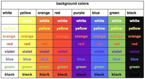
Contrast and Mixing Colors Chart

Compare this color image to the black and white image in your book. You may think that red against green should jump out at you. When looking at the grayscale image of this chart you can see that there is very little contrast between these two colors.
4.5
Graphic Elements

“The Noun Project collects, organizes and adds to the highly recognizable symbols that form the world’s visual language, so we may share them in a fun and meaningful way.” All images are free.
4.6
Visual Design with Audio, Video and Multi-Media
4.7
Visual Design and Mobile Devices
4.8
Resources
Useful Sites for Designing Information in an Online Course
These sites have useful information for web designers and developers and anyone designing information online. You can go here to see examples of good web design. The Web Style Guide is a great book to own as a reference.


